 Text To Design
Mastering Figma Constraints for Flexible Layout Designs
No results found
9/12/2024
Mastering Figma Constraints for Flexible Layouts
In the fast-evolving world of digital design, ensuring your layouts are flexible and adaptable is key to maintaining a seamless user experience across different devices and screen sizes. Figma, with its robust suite of tools, offers powerful features like constraints and auto-layout that can help designers build flexible and responsive designs efficiently. In this comprehensive guide, we'll delve into Figma constraints, auto-layout properties, and best practices to create scalable and dynamic designs.
Understanding Figma Constraints
Constraints in Figma allow you to control how elements within a frame respond to resizing. This feature is essential for creating designs that adapt to various screen sizes, ensuring that your components maintain their relative positioning and size.
Key Concepts of Figma Constraints
- Pinning: Elements can be pinned to any side of the frame (top, bottom, left, right), ensuring they maintain their position relative to that side when the frame is resized.
- Scaling: Elements can scale proportionately when the frame is resized, maintaining their aspect ratio.
- Centering: Elements can be centered horizontally or vertically within a frame.
By combining these constraints, you can achieve a high degree of control over your designs, ensuring they remain flexible and responsive.
Combining Layout Grids and Constraints
Layout Grids
Layout grids are visual aids that help you align elements within a frame. They provide a consistent structure and are particularly useful in creating designs that follow a uniform grid system.
Using Constraints with Layout Grids
By using constraints in conjunction with layout grids, you can create more precise and flexible layouts. For instance, you can pin elements to the grid lines, ensuring they maintain their alignment even when the frame is resized.
Example: Imagine you have a navigation bar pinned to the top of the frame and stretched across the width. By setting constraints, you can ensure that the navigation items remain evenly spaced and aligned, regardless of the frame's width.
For more detailed information on combining layout grids and constraints, refer to Figma's Help Center.
Best Practices for Using Constraints
Pinning Buttons in the Corners
Pinning buttons to the corners of your frame can ensure they stay in the correct position when the frame is resized. This technique is particularly useful for creating responsive navigation bars or footer sections.
The Magic of Components + Constraints
Using components with constraints can significantly enhance your design workflow. Components allow you to create reusable design elements that maintain their constraints, ensuring consistency across your design.
For tips on effectively using constraints, check out Figma's Best Practices.
Exploring Figma's FlexBox Layouts
Figma's approach to flexible layouts is inspired by CSS-Flex properties, making it easier for designers to create responsive designs that align with web development practices.
Key Properties of Figma FlexBox
- Flex Container: The parent element that holds flex items.
- Flex Items: The child elements within a flex container.
- Flex Direction: Defines the primary axis along which flex items are laid out (row or column).
By understanding and utilizing these properties, you can create layouts that adjust dynamically based on the content and screen size.
For a deep dive into Figma FlexBox layouts, read this comprehensive article on Timeless.
Practical Applications
Creating a Responsive Navigation Bar
- Frame Setup: Create a frame for the navigation bar and apply a layout grid.
- Add Elements: Add your navigation items and pin them to the top of the frame.
- Apply Constraints: Use constraints to ensure the navigation items stretch or stay centered when the frame is resized.
Designing a Flexible Card Layout
- Frame and Grid: Set up a frame with a layout grid for uniform spacing.
- Card Components: Create card components with constraints that allow them to resize.
- Auto Layout: Use Figma's auto layout feature to arrange the cards in a flexible grid that adjusts based on the frame's size.
Conclusion
Mastering Figma's constraints and flexible layout features can significantly enhance your design process, allowing you to create responsive and adaptable designs with ease. By understanding the principles of constraints, combining them with layout grids, and leveraging Figma's FlexBox properties, you can ensure your designs are ready for any screen size.
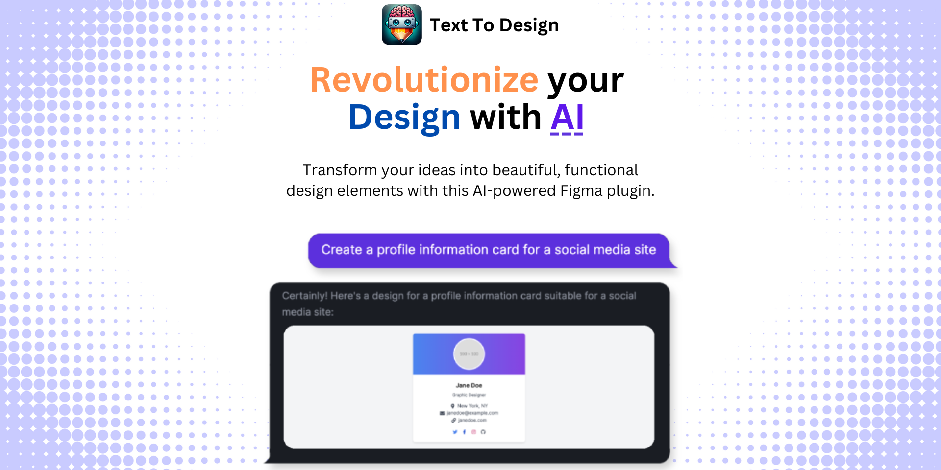
If you want to take your design workflow to the next level, consider using the Text To Design Figma Plugin. This advanced AI-powered tool transforms your text descriptions into innovative design ideas, streamlining the design process for designers, developers, and creative teams.
Explore more about Figma and design best practices on our website, and join our community of forward-thinking designers.
For additional learning resources, check out:
Happy designing!
Step Into the Future of Design with your AI Copilot
Join +40K designers revolutionizing their workflow with AI. Install our Text-to-Design plugin in just a few clicks to unlock your creative potential. Start for free and instantly generate designs for your project.
 Design with AI Now