 Text To Design
Embracing Constraints in Figma: An In-Depth Guide
No results found
4/7/2024
Embracing Constraints In Figma: An In-Depth Guide
Figma has become a go-to tool for designers, and one of its most powerful features is the ability to apply constraints for responsive design. In this blog post, we'll explore the ins and outs of Figma's flexible constraints system[^1^][^2^][^3^], and how it can enhance your design process.
Understanding Constraints In Figma
Constraints are rules that govern how elements in your design behave when their parent frame is resized[^1^]. They enable you to create designs that adapt to different screen sizes, maintaining the relative position and size of elements[^3^].
Two types of Constraints
Figma's constraint system offers you two types of constraints:
- Horizontal Constraints: These define how your elements should align horizontally when their parent frame resizes.
- Vertical Constraints: These dictate how your elements should align vertically when their parent frame resizes.
Each of these types comprises four options: 'Left', 'Right', 'Center' and 'Scale'. These options give you full control over how your design elements adjust and scale to fit varying screen sizes[^3^].
Tips for Using Constraints Effectively
1. Pinning a Button in the Corner
By applying constraints, you can pin a button in the corner and ensure that it remains in position, irrespective of changes in viewport size[^2^].
2. Magic of Components and Constraints
Components combined with constraints can work wonders. You can create responsive design elements that adjust based on their parent frame's dimensions[^2^].
3. Utilizing Constraints with Grids
Figma's constraints and grid systems, when used in conjunction, can create responsive designs that maintain alignment and proportions across varying screen sizes[^2^].
4. Table Cells
Constraints can help you design flexible table cells that maintain their proportions and alignment as the table size changes[^2^].
5. Illustrations
When working with complex illustrations, constraints can help maintain the aspect ratio and positioning of various parts of the illustration[^2^].
Case Study: Creating Responsive Layout Templates in Figma
Figma's constraints feature is crucial when launching multiple apps on various platforms within a short timeframe[^1^]. The littleBits Design & Engineering team provides an insightful case study on how they created templates with responsive layouts using constraints and a concept known as 'magic numbers'[^1^].
They established '8' as their magic number, which served as a common factor for sizes and padding, harmonizing their layout elements. The team also utilized Figma's responsive constraints to ensure their designs looked good on different screen sizes, including tablets and smaller phones, without compromising the overall experience[^1^].
Conclusion
Figma's constraints system is a powerful feature that can significantly streamline your design process, allowing you to create responsive designs that adapt effectively to various screen sizes. As a designer, understanding and leveraging these constraints can help you produce better, more adaptable designs.
Call to Action
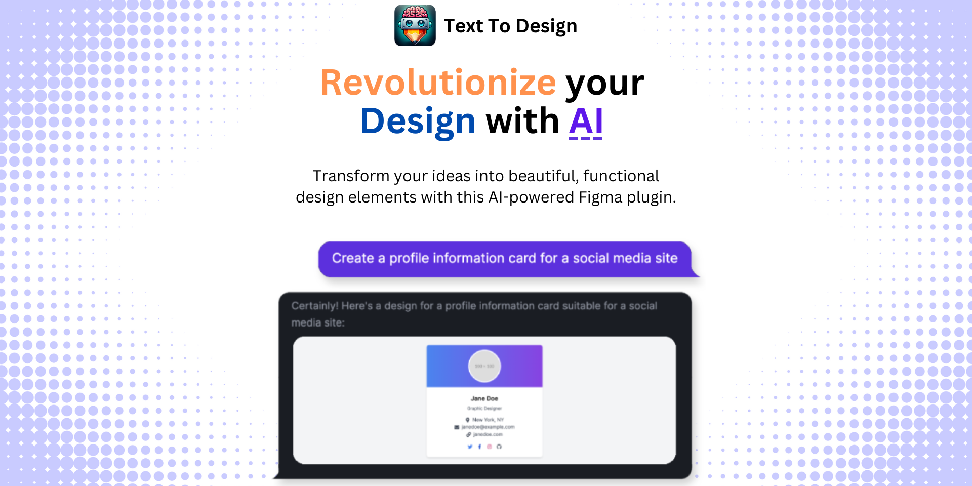
Ready to take your designs to the next level? Try out the Text To Design Figma Plugin to transform your text descriptions into innovative design ideas. Ideal for designers, developers, and creative teams.
[^1^] : Creating Responsive Layout Templates in Figma [^2^] : Tips for Using Constraints in Your Workflow [^3^] : How to Use Figma Constraints: The Simple Guide
Step Into the Future of Design with your AI Copilot
Join +40K designers revolutionizing their workflow with AI. Install our Text-to-Design plugin in just a few clicks to unlock your creative potential. Start for free and instantly generate designs for your project.
 Design with AI Now