 Text To Design
Nailing the Dark Mode UI in Figma: A Comprehensive Guide
No results found
12/24/2023
Nailing the Dark Mode UI in Figma: A Comprehensive Guide
If you are a designer who is passionate about creating the best user interfaces (UIs), then you might already know the importance of the dark mode UI. Dark mode is a feature that changes the color scheme of an application or website, where light text is displayed on a dark background. It enhances visibility and reduces eye strain, making it a popular feature among users1.
This blog post will provide you with a comprehensive guide full of tips and tricks on how to create an engaging and efficient dark mode UI in Figma.
What is Dark Mode?
Dark mode is a setting that changes the background of an application or website from light to dark, making it easier on the eyes in low-light conditions. It's a feature that's becoming increasingly popular in digital products, and it's essential for designers to know how to design for it.
Why Dark Mode?
The benefits of dark mode include:
- Reduced eye strain: Dark mode reduces the light emitted by device screens while maintaining the minimum color contrast ratios required for readability.
- Energy conservation: AMOLED screens use less power displaying dark colors.
- Aesthetically pleasing: Dark mode can give your design an elegant and modern look2.
Implementing Dark Mode in Figma
Here's a step-by-step guide to implementing Dark Mode in Figma:
Step 1: Dedicate Components for Dark Mode
Using dedicated components for dark mode ensures consistency and ease of use. This also allows any changes made to reflect across all instances of that component, making it easier to maintain your dark theme3.
Step 2: Map Colors for Different Themes
Mapping colors for different themes helps in making your design scalable. Creating a color mapping guide can help in swapping colors when switching between light and dark themes3.
Step 3: Manual Color Swapping in the Properties Panel
Although this might be time-consuming, manual color swapping in the properties panel allows for the highest level of control and customization3.
Step 4: Use Separate Color Libraries
Using separate color libraries and swapping them in Figma can simplify the process of transitioning your designs from light to dark3.
Best Practices for Designing Dark Mode UI
Now that we've covered how to implement dark mode in Figma, let's discuss some best practices for designing dark mode UI4:
-
Plan your color use: Limit the number of colors you use in your dark mode design. Too many colors can make your design look busy and distract from your content.
-
Brand your dark colors: Use the dark variant of your brand colors to maintain brand identity.
-
Reduce color saturation: Colors appear more vibrant against a dark background, so reduce the saturation to prevent them from overpowering your design.
-
Communicate depth: Use shadows and gradients to communicate depth and hierarchy in your design.
-
Ensure contrast: Ensure your design maintains a high level of contrast to keep it legible and accessible5.
Conclusion
Designing for dark mode means considering several factors, including color use, branding, saturation, depth, and contrast. Understanding and implementing these best practices will help you create engaging and efficient dark mode UIs in Figma.
With the Text To Design Figma Plugin, you can automate and streamline many of your design processes, saving you time and effort. This AI-powered plugin can transform your text descriptions into innovative design ideas, making it an excellent tool for designers, developers, and creative teams.
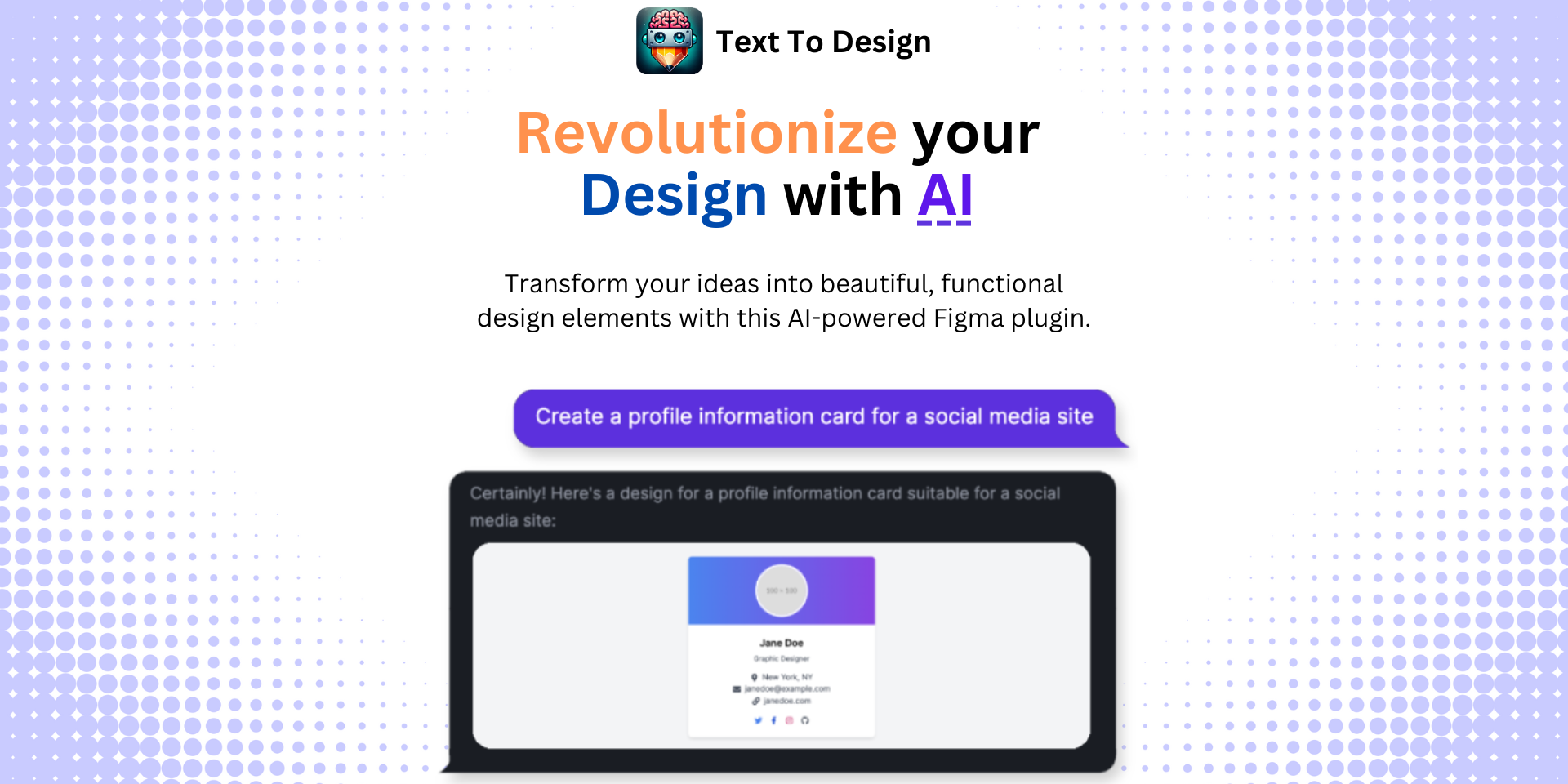
Whether you're a seasoned designer or just starting out, mastering Figma and leveraging its powerful features, like dark mode, can help you create more dynamic and engaging designs. So why wait? Get the Text To Design Figma Plugin now and revolutionize your design process!
Footnotes
Step Into the Future of Design with your AI Copilot
Join +40K designers revolutionizing their workflow with AI. Install our Text-to-Design plugin in just a few clicks to unlock your creative potential. Start for free and instantly generate designs for your project.
 Design with AI Now